
Nardone
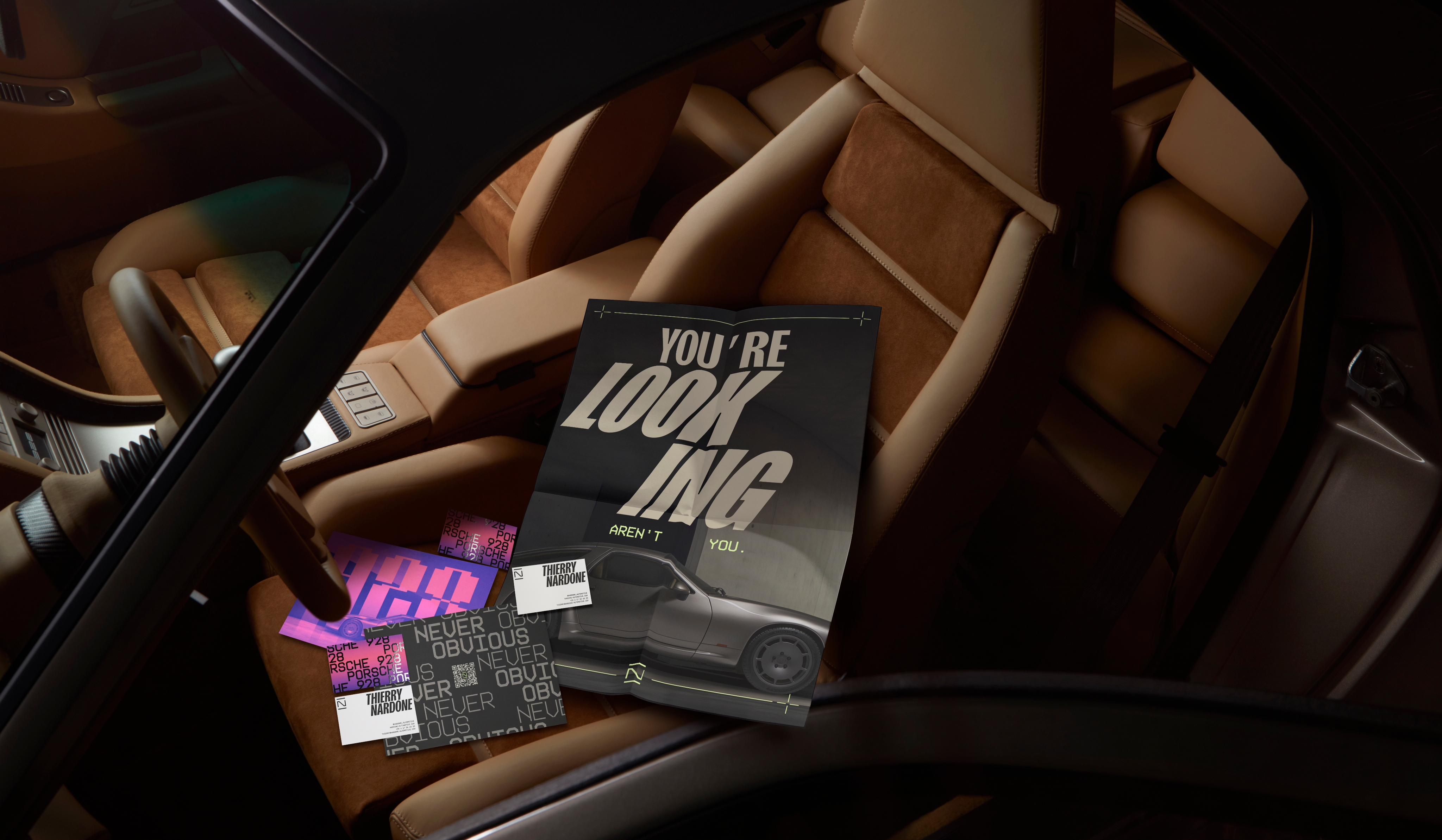
I worked as the lead designer on this project at Poppins where I built the brand identity for Nardone Automotive. With only a name and a radically reimagined Porsche 928 in development, we worked closely with founder Thierry Nardone to shape a visual language that embodied the car’s intentionally unconventional spirit. Rooted in the brand philosophy of Never obvious, the identity celebrates a machine designed for those who look beyond the expected.
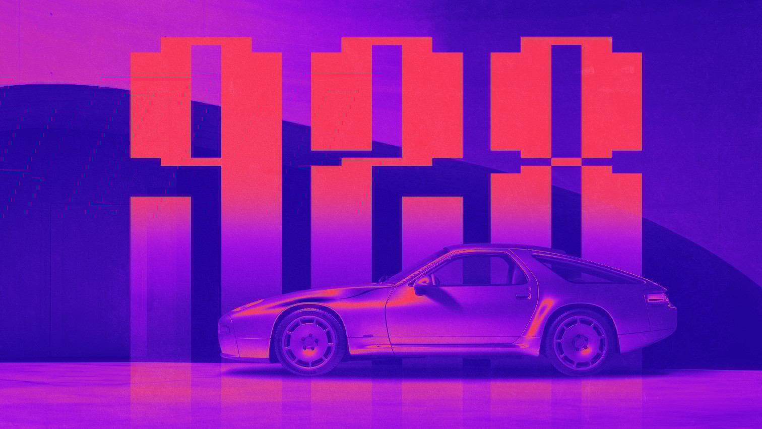
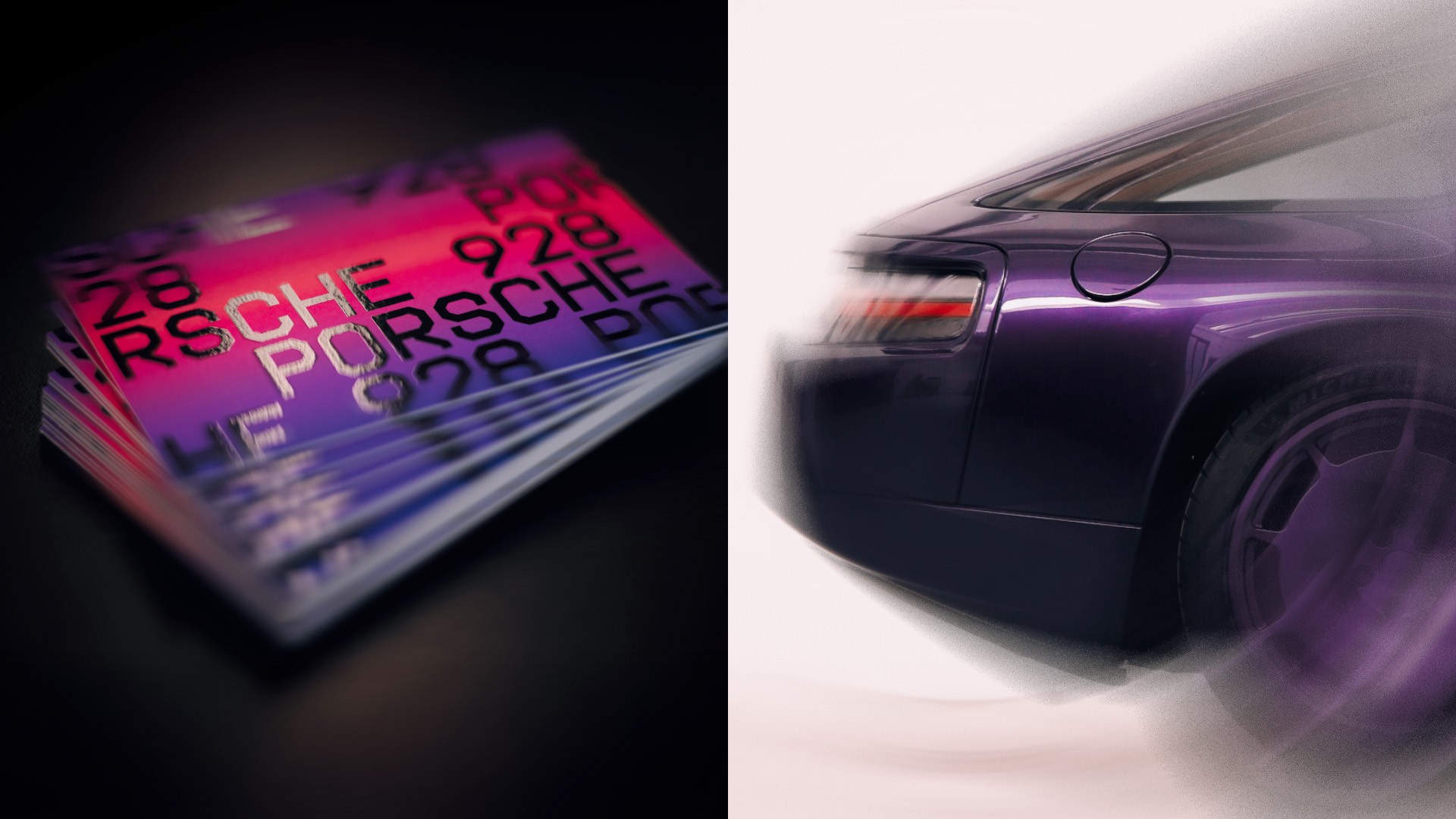
The 928 is described as the most underrated Porsche of them all; a model that pushed the boundaries of what had gone before. I based the brand identity on the character of the 928 and Thierry Nardone’s love for it: original, purposeful, irreverent. The futuristic-retro visual identity takes cues from the decidedly 1980s car design, sitting somewhere between modernism and synthwave and aligning with the divisive, but undeniably stylish, hard edges of Brutalism.
Brand Design
Art direction
A Refined Baseline
I built the visual identity around a 5-point baseline grid derived directly from the Nardone’s dashboard, a detail that became the structural backbone of the entire system. This modular, Braun-esque grid informed layouts, motion principles and the full digital experience.
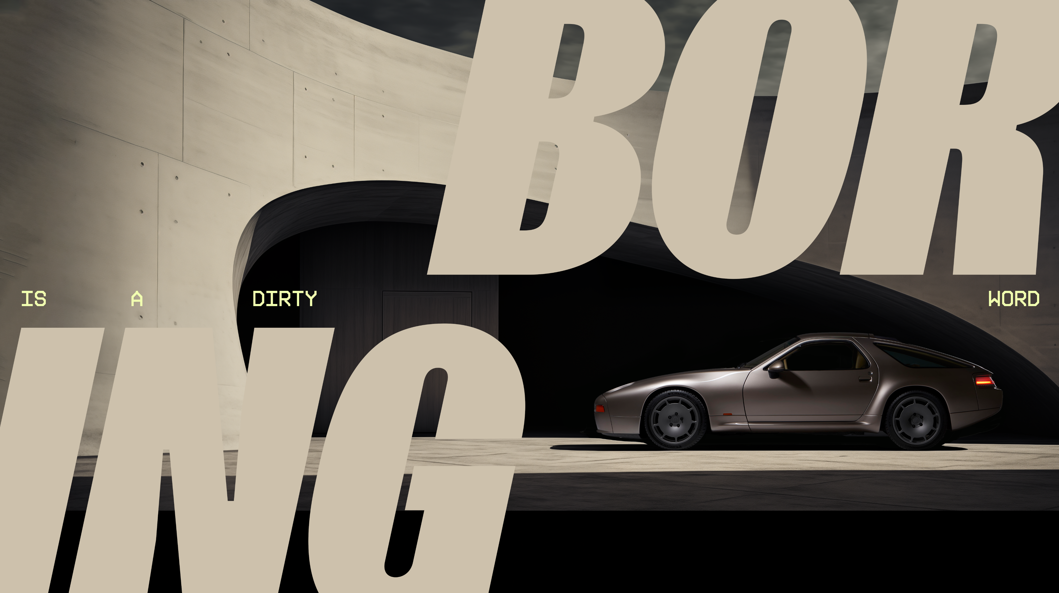
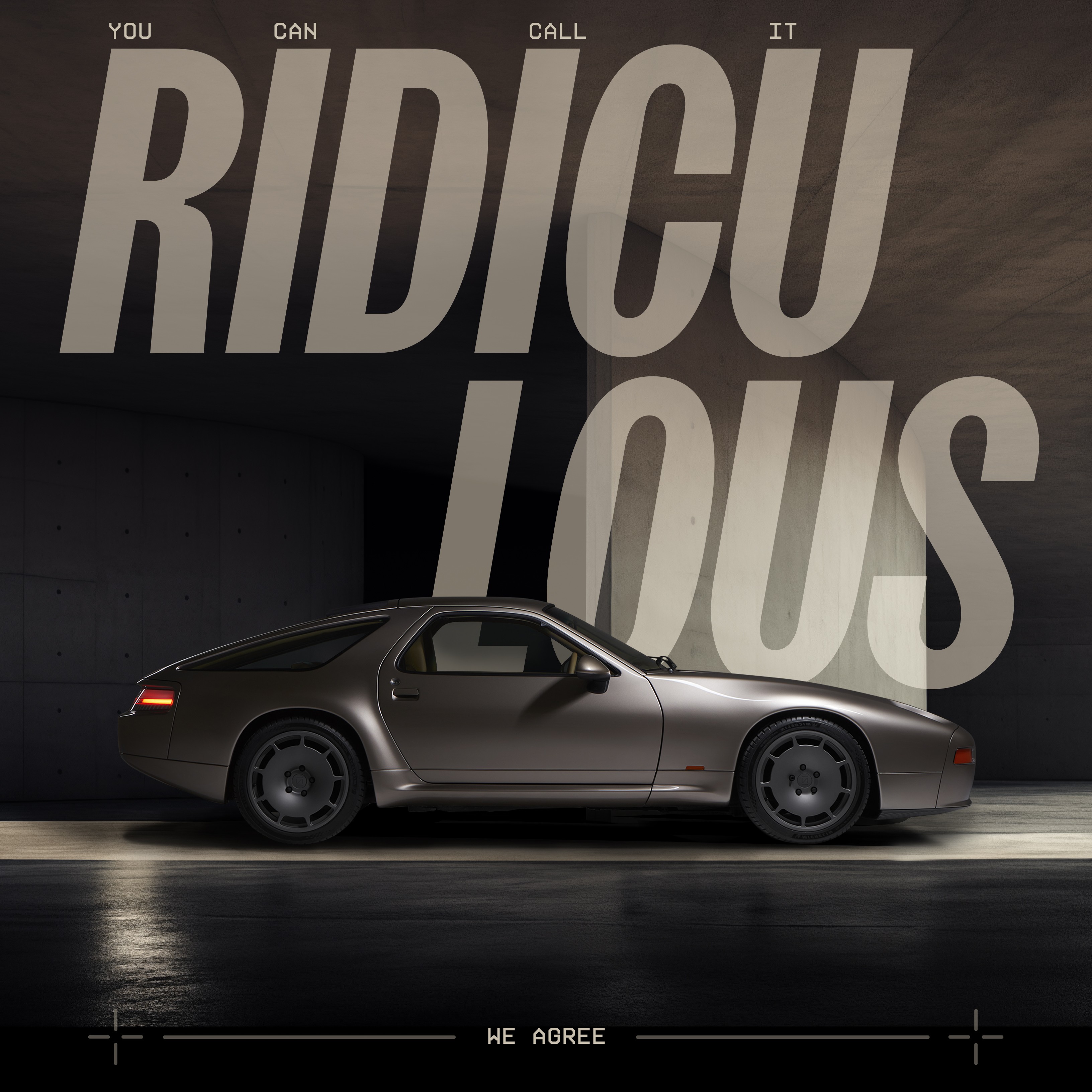
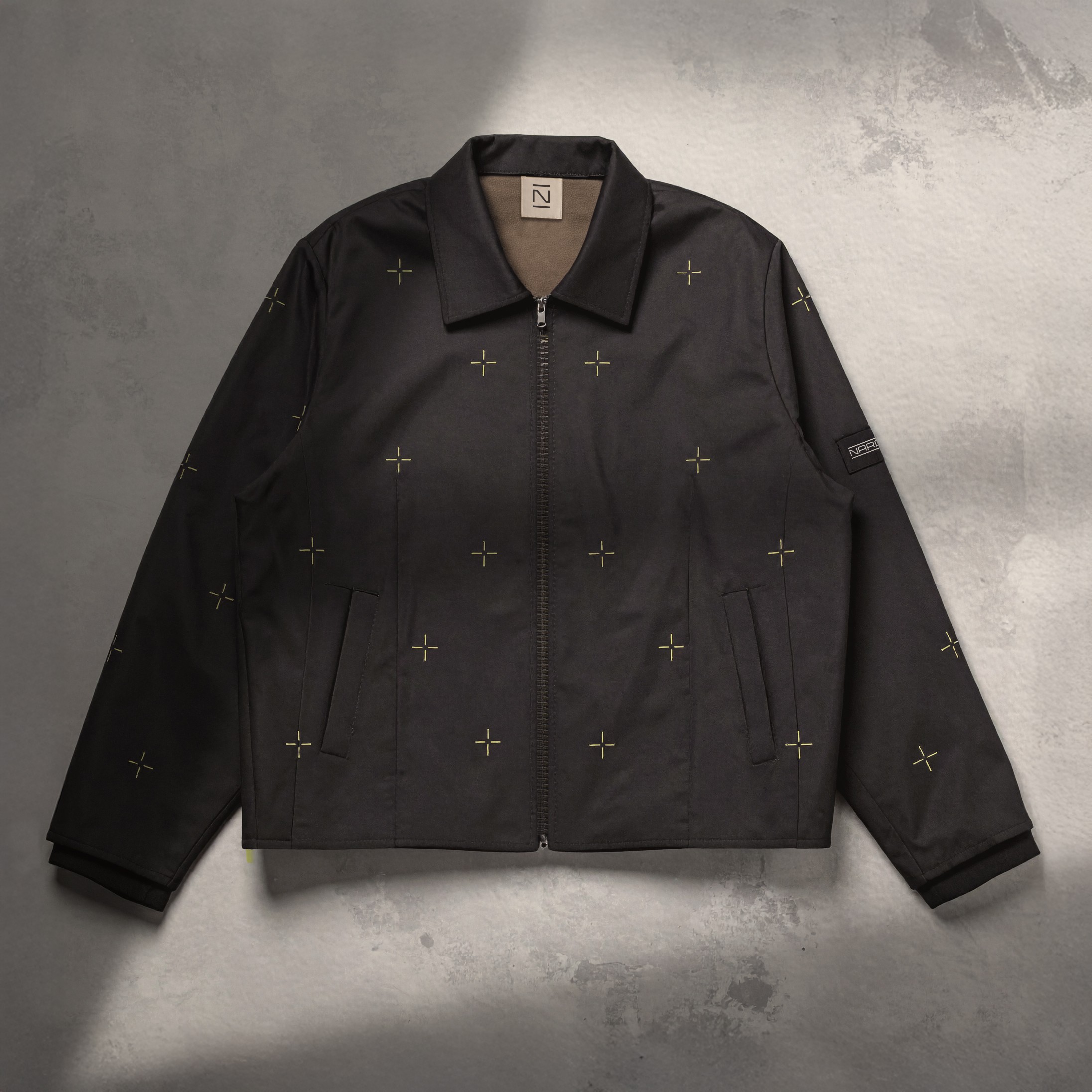
For typography, I selected Sans Plomb, inspired by 1980s French roadsigns, as a nod to Thierry’s roots and his first drive in a 928. Paired with messaging that leans into tension and double-takes, the typography reinforced the risk, precision and irreverence at the heart of the brand.
Then and Now
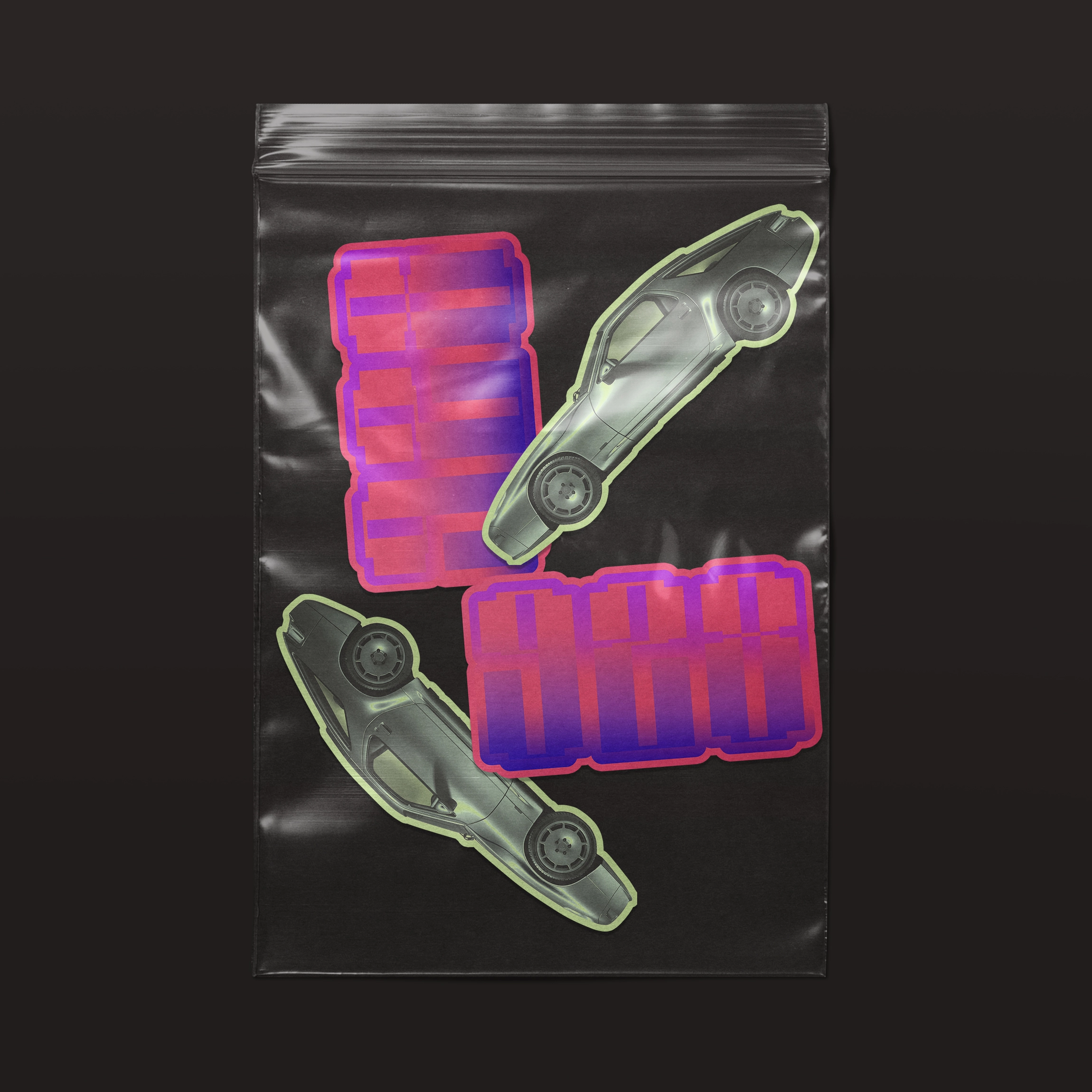
I combined colour and materiality to create a tactile, detail-driven identity that mirrors Thierry Nardone’s obsession with details. Matte meets gloss, gradients (representing the eye-catching 1980’s aesthetic) meet true-tone (representing the more digital focus of today), balancing modern luxury with bold 1980s attitude.
We also built the entire website in two colourways, ready to flip at the touch of a button; ‘never obvious,’ Nardone connects then and now, play and precision.
Technical Excellence
Anchored by the 5-point grid, I designed motion and interaction principles that echoed the car’s engineered precision, using animated crosshairs, purposeful lazy-loading and ticker-tape typography to reveal its underlying structure. Drawing on blueprint and technical drawing language, I introduced visual and kinetic cues that reflected Thierry’s ethos of working with best-in-class specialists. Together, these elements expressed a brand built on collaboration, craft and engineering that deserves to be seen, not hidden.

Other Projects
See Project

See Project

See Project

Let’s chat


CONTACT
+44 7917421586
indigopricedesign@gmail.comSOCIAL
Spotify

Work
About
Contact
Nardone
I worked as the lead designer on this project at Poppins where I built the brand identity for Nardone Automotive. With only a name and a radically reimagined Porsche 928 in development, we worked closely with founder Thierry Nardone to shape a visual language that embodied the car’s intentionally unconventional spirit. Rooted in the brand philosophy of Never obvious, the identity celebrates a machine designed for those who look beyond the expected.
The 928 is described as the most underrated Porsche of them all; a model that pushed the boundaries of what had gone before. I based the brand identity on the character of the 928 and Thierry Nardone’s love for it: original, purposeful, irreverent. The futuristic-retro visual identity takes cues from the decidedly 1980s car design, sitting somewhere between modernism and synthwave and aligning with the divisive, but undeniably stylish, hard edges of Brutalism.
Brand Design
Art direction
A Refined Baseline
I built the visual identity around a 5-point baseline grid derived directly from the Nardone’s dashboard, a detail that became the structural backbone of the entire system. This modular, Braun-esque grid informed layouts, motion principles and the full digital experience.
For typography, I selected Sans Plomb, inspired by 1980s French roadsigns, as a nod to Thierry’s roots and his first drive in a 928. Paired with messaging that leans into tension and double-takes, the typography reinforced the risk, precision and irreverence at the heart of the brand.
Then and Now
I combined colour and materiality to create a tactile, detail-driven identity that mirrors Thierry Nardone’s obsession with details. Matte meets gloss, gradients (representing the eye-catching 1980’s aesthetic) meet true-tone (representing the more digital focus of today), balancing modern luxury with bold 1980s attitude.
We also built the entire website in two colourways, ready to flip at the touch of a button; ‘never obvious,’ Nardone connects then and now, play and precision.
Technical Excellence
Anchored by the 5-point grid, I designed motion and interaction principles that echoed the car’s engineered precision, using animated crosshairs, purposeful lazy-loading and ticker-tape typography to reveal its underlying structure. Drawing on blueprint and technical drawing language, I introduced visual and kinetic cues that reflected Thierry’s ethos of working with best-in-class specialists. Together, these elements expressed a brand built on collaboration, craft and engineering that deserves to be seen, not hidden.

Other Projects
See Project
See Project
See Project

Let’s chat

CONTACT
+44 7917421586
indigopricedesign@gmail.comSOCIAL
Spotify
Nardone
I worked as the lead designer on this project at Poppins where I built the brand identity for Nardone Automotive. With only a name and a radically reimagined Porsche 928 in development, we worked closely with founder Thierry Nardone to shape a visual language that embodied the car’s intentionally unconventional spirit. Rooted in the brand philosophy of Never obvious, the identity celebrates a machine designed for those who look beyond the expected.
The 928 is described as the most underrated Porsche of them all; a model that pushed the boundaries of what had gone before. I based the brand identity on the character of the 928 and Thierry Nardone’s love for it: original, purposeful, irreverent. The futuristic-retro visual identity takes cues from the decidedly 1980s car design, sitting somewhere between modernism and synthwave and aligning with the divisive, but undeniably stylish, hard edges of Brutalism.
Brand Design
Art direction
A Refined Baseline
I built the visual identity around a 5-point baseline grid derived directly from the Nardone’s dashboard, a detail that became the structural backbone of the entire system. This modular, Braun-esque grid informed layouts, motion principles and the full digital experience.
For typography, I selected Sans Plomb, inspired by 1980s French roadsigns, as a nod to Thierry’s roots and his first drive in a 928. Paired with messaging that leans into tension and double-takes, the typography reinforced the risk, precision and irreverence at the heart of the brand.
Then and Now
I combined colour and materiality to create a tactile, detail-driven identity that mirrors Thierry Nardone’s obsession with details. Matte meets gloss, gradients (representing the eye-catching 1980’s aesthetic) meet true-tone (representing the more digital focus of today), balancing modern luxury with bold 1980s attitude.
We also built the entire website in two colourways, ready to flip at the touch of a button; ‘never obvious,’ Nardone connects then and now, play and precision.
Technical Excellence
Anchored by the 5-point grid, I designed motion and interaction principles that echoed the car’s engineered precision, using animated crosshairs, purposeful lazy-loading and ticker-tape typography to reveal its underlying structure. Drawing on blueprint and technical drawing language, I introduced visual and kinetic cues that reflected Thierry’s ethos of working with best-in-class specialists. Together, these elements expressed a brand built on collaboration, craft and engineering that deserves to be seen, not hidden.

Other Projects
See Project
See Project
See Project

Let’s chat

CONTACT
+44 7917421586
indigopricedesign@gmail.com
SOCIAL
Spotify